Edit view
The edit view feature allow you to edit the current view of the page on which you are working. There are two types of pages, list pages and form pages. How you edit the view depends on the type of page you want to edit.
 Edit a list page
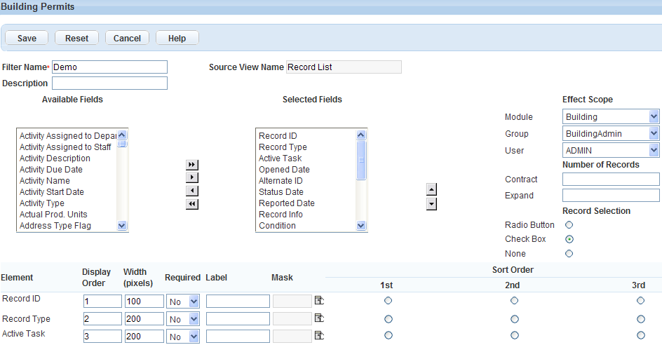
The edit view feature allows you to create a page list display to your specifications and name it as a filter. First, choose which fields you want to display. Then, apply the customization to those fields. You can add a label for the field, specify its width, apply a mask, define sort order, and define display order. You can also specify how many items to display for an expanded and a contracted list.
To edit the view of a page list
-
From a list page, select Menu > Edit view.
-
Show or hide fields to display in the selected page. Fields in the Selected fields box display in the page view. Fields in the Available fields box do not display in the page view.
-
Select a field name to highlight it. Press the Ctrl key to select multiple fields at a time.
-
Use the arrow keys to move the fields between the Available fields or Selected fields boxes. Double arrow keys move all fields, whether selected or not, to the destination box.
-
-
Arrange the sequence of the fields in the Selected fields box.
-
Select a field name.
-
Select the up or down arrow to change its position.
-
-
Complete the remaining fields as necessary.
Field Description A > Z Ascending Use to sort field data alphabetically from A to Z. Contract The number of items to display on a page when you contract the list. Description The description for the filter you are creating. Effect Scope The availability of the customized sort/filter using the drop‑down feature for Module, Group, and User. Element Civic Platform lists the fields in the Selected Fields box in their current order. Expand The number of items to display on a page when you expand the list. Filter Name A descriptive name for the filter. Label A customized label for the field. Mask A mask to limit the type of data a field accepts. A mask might include symbols for currency, phone number, SSN, or zip code. Record Selection The type of record selection tool you want to choose for the list. Choices include Radio button or Check box. Sort Order Indicates the sort priority of an item. Defining sort order is useful for organizing as well as grouping list items. Source View Name The name of the form that you are modifying. Width (pixels) The number of pixels for the column width. Z > A Descending Use to sort field values alphabetically from Z to A. -
Select Submit.
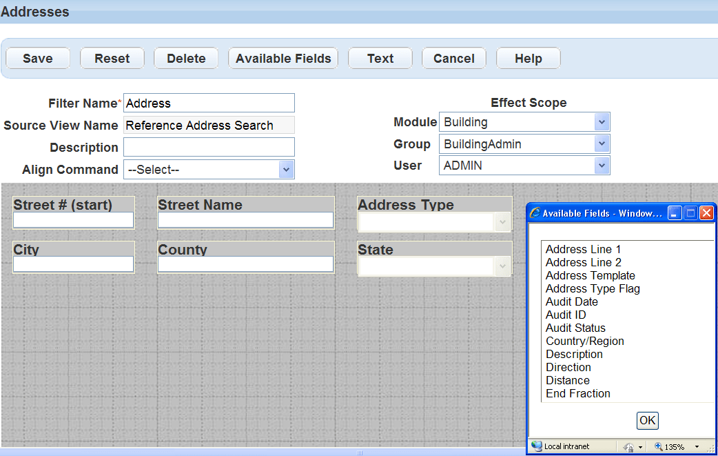
Edit a form page
Civic Platform provides the Edit view feature to customize how information displays in a form.
To edit the view of a form portlet
-
Locate the form portlet you want to customize and select Menu.
-
Choose the Edit view option from the drop-down menu.
-
Complete these fields:
Field Description Filter name Enter a descriptive name for the form portlet. This filter name is the name you can use to locate the form using the Form Designer. Source view name This field is not editable. Description Enter a description to help identify the purpose of the form. Align command Use this drop-down list after you have added fields to the form. Select one or more fields and choose the desired option from the drop-down list. Effect scope Specify the availability of the customized filter for the desired module, user group, or user with the corresponding drop-down list. -
To show an available field:
-
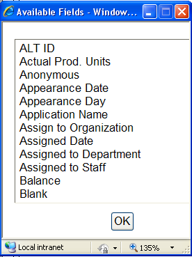
Select Available fields.
-
Select a field from the list.
Note: To select multiple fields, double-click each field. -
Select OK.
Note: The Available fields list also provides the address template, parcel template, or owner template options. If you select any of those options, Civic Platform removes the option from the list and displays all active attributes of the selected template as additional fields on the form. The APO form layout editor defines the layout and display of each field in a template.
On the record search form, only record-searchable attributes display as available fields. You can specify which attributes are record-searchable when creating or editing a template.
-
-
To hide a selected field, select the field on the form and select Delete.
-
To change the position of a field, drag the field to the new position on the form.
-
To change a field's name or its properties:
-
Double-click the field you want to change.
Note: Depending on the type of form you are editing, your options vary.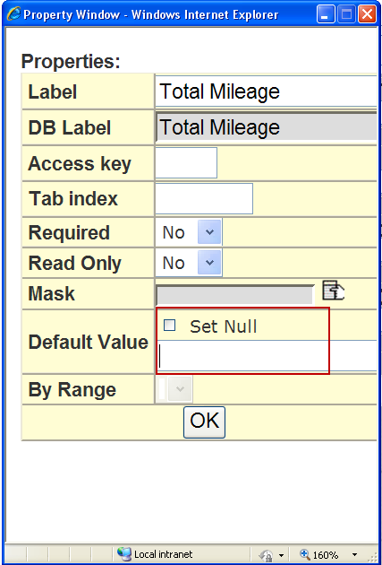
-
Complete the field properties as necessary.
Field Description Access key Enter the shortcut key that users can press together with the ALT key to position the cursor in this field.
Example: if you want users to be able to access the Asset ID field by pressing ALT+I, enter the letter I in this field.By range When applicable, allows the user to search this field based on a range of values. The default is Yes. If you select No, the field allows for searching on a single field, not on a range. (Optional) DB label This field is display-only. It shows the actual name of the field as it displays in your database. Default value Set a default value for the field on a search form portlet. The default value you set appears in the field whenever users navigate to the search form portlet.
If you do not supply a value, the field can either be blank (null) or it can display the value that the user entered during his or her last search, depending on the field type.
If you want this type of field to always appear as blank (null) in a new search, select Set null in the Default value property setting for the desired field. This property is only available for fields on search form portlets.
The default value varies depending on the By range field property. When you set the By range field property to Yes, Civic Platform displays the Default from and Default to properties instead of the Default value property. When you set it to No, Civic Platform displays the Default value property only.
For more information on setting a default value for a search field, see Edit view.
Label Enter a label for the field as you want it to display on the form. Mask Choose a mask type from the list of masks to apply to the field. Read only The default is No. Use the drop-down list and choose Yes to make the field read-only when users access the form. Whichever level you design the form for, the read-only characteristic then affects all of its sub-levels.
Example: If you design the form for the agency level, the read-only attribute applies to the sub-levels of module, user group, and individual users. However, if you design the form at the module level, then the read-only characteristic applies to the sub-levels of user group and users.Required Specify if you want to make the field to be required. When completing a form, users must enter information in a required field. Required fields display in the Form Layout Editor as well on the actual form with a red asterisk. Tab index Enter a number to determine the position of this field in a tab sequence. When a user is working with a form, they can press the TAB key to move from field to field. The index number determines the order in which this field becomes active in relation to other fields on the same form. -
Select OK.
-
-
When you are satisfied with the appearance of your form select Submit.
See also