Design branding in Public Portal
You can configure the look and feel of the user-facing portion of Public Portal to match your agency's style.
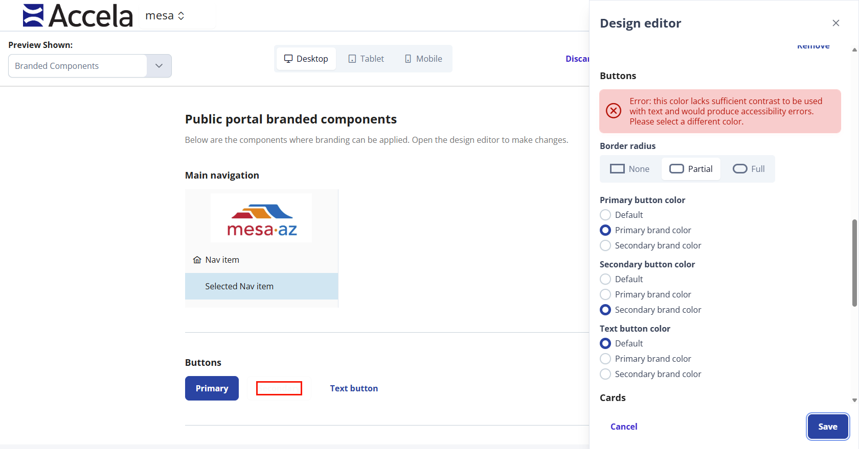
Note: The design editor has built-in safeguards to guarantee your colors stay within accessibility and compliance. You will receive a warning if you select a font and background color that are inaccessible.
To design branding in the Public Portal
-
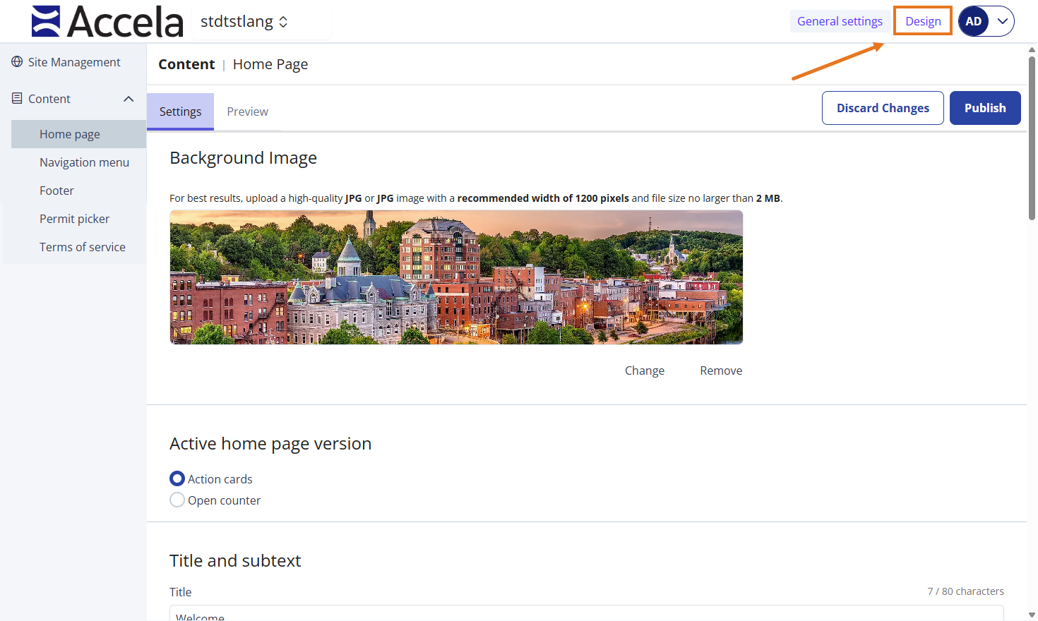
From Public Portal administration, select Design.
-
Select Open design editor.
-
Select your settings for each section.
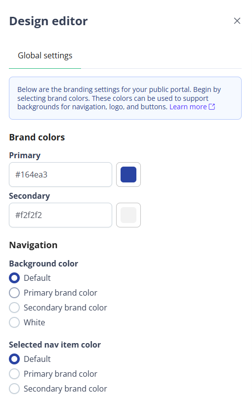
Name Description Brand colors
Primary The primary color for your brand that displays on your user-facing Public Portal.
Default primary color is #164EA3.
Secondary The secondary color for brand that complementary.
Default secondary color is #F2F2F2.
Navigation Background color -
Default
-
Primary brand color
-
Secondary brand color
-
White
Selected nav item color -
Default
-
Primary brand color
-
Secondary brand color
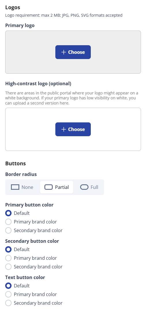
Logos Primary logo The primary logo displays on the home page of the Public Portal when a public user logs in.
Tip: Your logo should not exceed 2 MB. Acceptable formats include JPG, PNG, and SVG.(Optional) High-contrast logo This is an optional logo. This logo is used in some parts of the Public Portal when the logo needs to be compressed or displayed with a greater resolution.
Example: When your logo is displayed on a white background.Buttons Border radius -
None
-
Partial (Default)
-
Full
Primary button color -
Default
-
Primary brand color
-
Secondary brand color
Secondary button color -
Default
-
Primary brand color
-
Secondary brand color
Text button color -
Default
-
Primary brand color
-
Secondary brand color
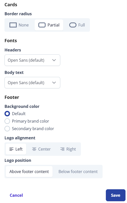
Cards Border radius -
None
-
Partial (Default)
-
Full
Fonts Headers Any HTML header tag H1-H5, this includes the headers in cards.
The default font is Open Sans.
Body text Any text that is not classified as a header (H1-H5).
The default font is Open Sans.
Footer Background color -
Default
-
Primary brand color
-
Secondary brand color
Logo alignment -
Left (Default)
-
Center
-
Right
Logo position -
Above footer content (Default)
-
Below footer content
-