Form portlet designer
The form portlet designer tool enables you to edit form fields on the same page and to allow access to those fields according to agency, module, user group, or user. The result is a customized, fully responsive form that loads faster and provides a more unified look and feel to the people that use it.
Important: Please read the Form permissions and field attributes section to learn about form permissions for users and how field attributes work between forms on the Agency, Module, User group and User tabs.
 Form permissions and field attributes
Form permissions
You configure form permissions by adding forms to the various user permission tabs (that is, the Agency, Module, User group and User tabs). If the same form is listed in multiple permission tabs, the form that displays to the user depends on the priority of the tab(s) in which the form is configured.
Note: If a form is not configured on any of the permission tabs, users will see the system default version of that form when working in the applicable application.
The user permission tabs are prioritized as follows (from highest to lowest):
-
User tab
-
User group tab
-
Module tab
-
Agency tab
Example:
-
User A is assigned to the Reference Contact Form listed in the User tab. User A would see the User version of the Reference Contact Form when working in the applicable application.
-
User B is NOT assigned to the Reference Contact Form in the User tab, but User B belongs to the user group that is assigned to the Reference Contact Form in the User group tab. User B would see the User group version of the Reference Contact Form when working in the applicable application.
-
User C is NOT assigned to the Reference Contact Form in the User group or User tabs, but User C belongs to the module that is assigned to the Reference Contact Form in the Module tab. User C would see the Module version of the Reference Contact Form when working in the applicable application.
-
User D is NOT assigned to the Reference Contact Form in the User, User group, or Module tabs, but is assigned to that form in the Agency tab. User D would see the Agency version of the Reference Contact Form when working in the applicable application.
Field attributes
Changing a field’s attribute on a form in one permission tab does not affect the same field’s attribute on the same form in a different permission tab.
Design a form
To design a form portlet
-
From the Administration menu, select Agency profile > Form portlet designer.
-
Identify which users you are granting access to your new form.
-
Select the tab that corresponds with the access-level you are creating for the form, that is Agency, Module, User group, or User tab.
Screen example
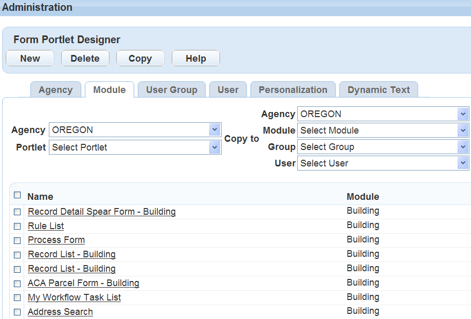 Tip: Best practice is to design the form on the Agency tab and then restrict or allow access based on any of the other levels, such as Module, User group, and/or User.
Note: If you choose the User tab you can limit access to just one user, which eliminates the possibility for other groups to access the form.
-
Choose a portlet from the Portlet menu.
-
Select New.
-
Select the agency, module, group, or user, depending on the tab you selected.
-
Complete these fields.
Field Description Filter name (Required) Enter a filter name.
Tip: Use a descriptive name for the filter so that you can identify it in the portlet list. Best practice is to include some or all of the Source view name as the Filter name.Note: After you save the filter, the Filter name displays in the Name column of the portlet list.Description Enter a brief description of the filter. Source view name Displays the source form name
Note: This field is read-only and cannot be modified. -
Arrange the fields on the form in the same order you want them to appear for users when they complete the form. For more information, see Grid layout, Controls panel, and/or Element control buttons and icons.
-
Edit the field labels, according to your agency's business objectives. To edit field labels:
-
Hover over the field control and select Properties.
-
Modify any of the properties as desired.
Note: You cannot change the database label (DB label) or other field properties that are not available. -
Select OK.
-
-
When you have completed the form, select Save.
Grid layout
The form portlet designer layout has 12 grids that define the shape of all of the available fields and elements. Each element automatically snaps to one of the 12 grid slots, making a more uniform appearance for all the forms. If you overlay any element on top of another, whether by moving it or resizing it, the field that was in that spot automatically shifts over to allow the new field. No fields can overlap another.
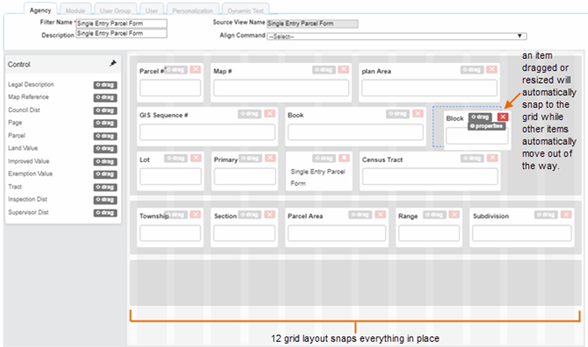
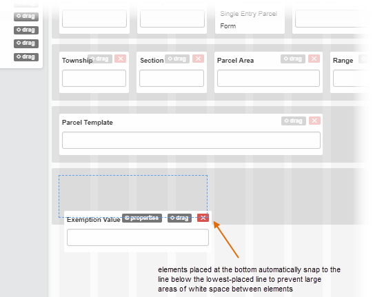
If you want to add something to the bottom of the screen, the grid also prevents large areas of white space from appearing at the bottom of the form by automatically aligning the added element to the previous lowest element. However, you can have as many lines as elements are available for a form. You are not limited by the vertical height as you were with the old designer.
Controls panel
The available fields display in a Controls panel that scrolls with the page as you are designing the form.
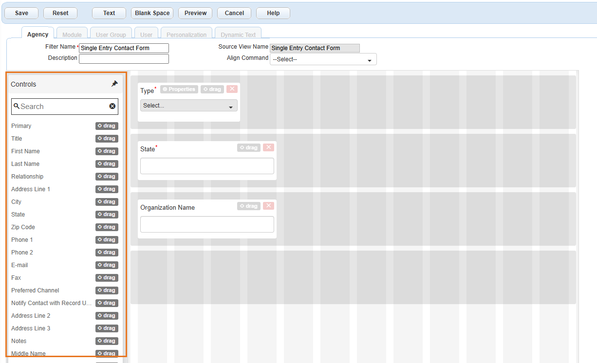
Add elements from the Controls panel to the form by dragging it over to the available grids. To drag an element, select and hold the drag button while moving the cursor.
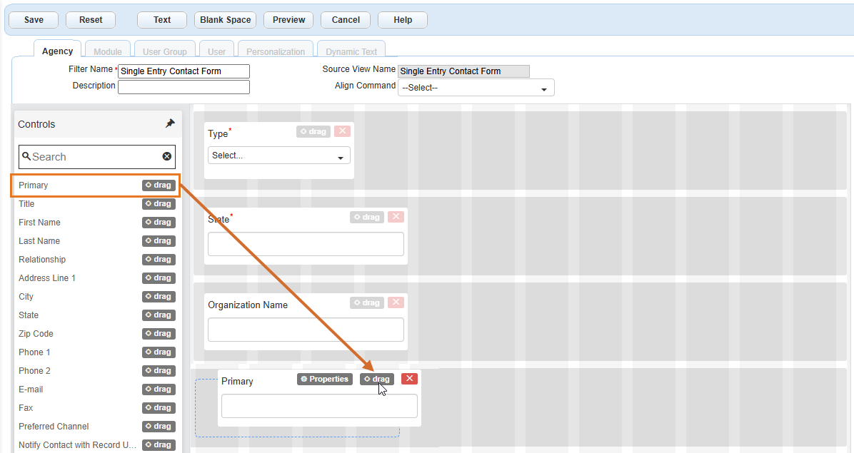
Remove elements from the form by selecting the delete button ( or
or  ) on the element.
 )at the top right corner of the Controls panel to unpin it. When it is unpinned, the available Controls list will scroll with the page so that you can view additional items on the list.Element control buttons and icons
Each element (or field) has buttons that you can use to edit or move the elements.
| Button | Image | Description and use |
|---|---|---|
| Delete (for database-controlled elements) |

|
This used to be on the main toolbar for the form designer. Now you will find the delete button on each element. Once these elements are removed, they return to the Controls panel. Note: Not all elements can be removed from a form. Some are required based on the type of form it is. |
| Delete (for dynamic labels) |

|
This used to be on the main toolbar for the form designer. Now you will find the delete button on each element. This icon is used only for dynamic (text) labels, which are not controlled by the database. These are completely removed from the form (not returned to the Control panel) when you select the delete button. |
| Drag |

|
Each element has a drag button to move them around on the grid. |
| Properties |

|
Hover over an element to display the Properties button. Select this button to open a dialog on the screen to edit the element's properties. |
| Resize height |

|
This option only appears on the Notes or Comments element, which is the only element that can have its height re-sized. Use this control to change the height of the Notes field on a form by selecting and holding the double lines and pulling the height to the desired size. Notes:
|
Elements that have some sort of interaction for your users to finish the form have icons on them to illustrate their function to your users.
| Icon | Image | Description and use |
|---|---|---|
| Calendar |

|
This icon indicates a calendar where your users can select a date instead of entering one. |
| Text fields |
|
This icon displays for general text fields, such as comments. For the Notes field, it is also an adjustable height button. |
| Menu lists |
|
This icon displays when the option is a drop-down menu list. |
See also